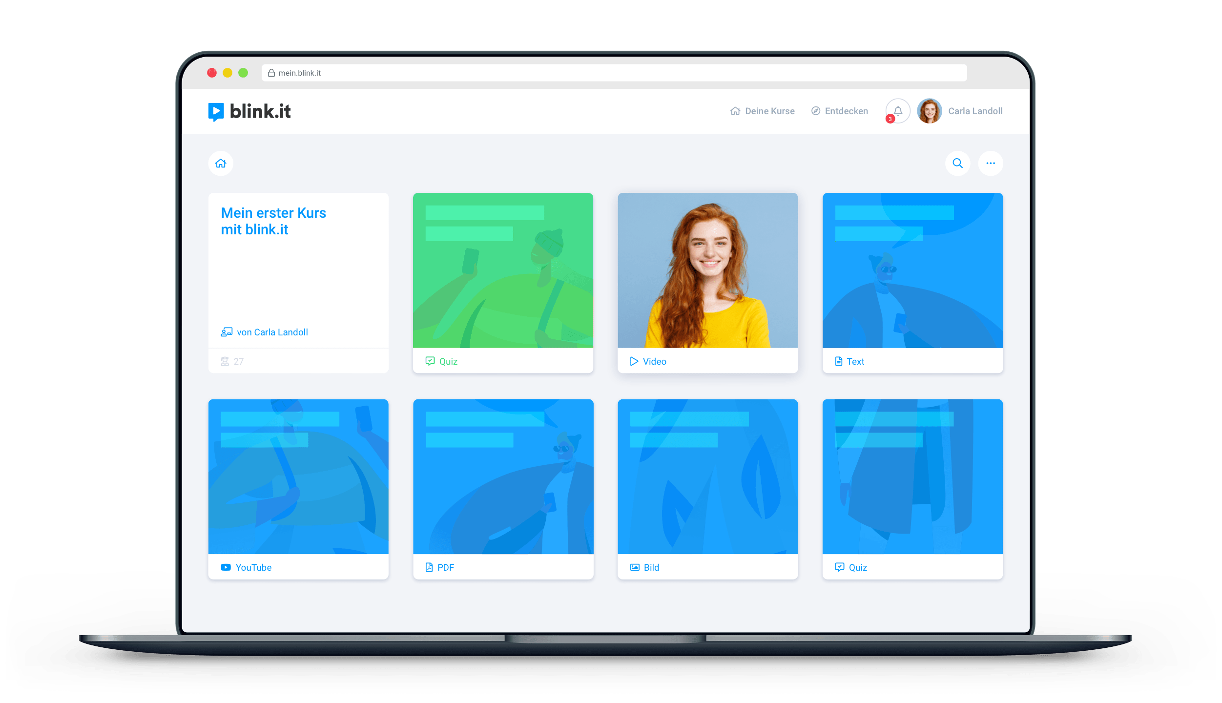
In 2022, the blink.it learning platform will rocket into the future with a new design, improved features and a wider range of functions. In this article, we answer the most important questions, give you first insights into the new blink.it and an outlook for the upcoming year.
You might have wondered why blink.it has been relatively quiet over the past year. It’s true, there were fewer visible updates and new features than in previous years. However, that doesn't mean we haven't been working on the platform. Quite the contrary! The product, design and development teams have poured their energy into a very special and comprehensive project: the "new blink.it"!
First we’ll give you an exciting look at the goals and the development process:
Two core goals of the "new blink.it," in particular:
- Modernization for better usability:
The iteration of blink.it as you know it today was created in 2016 and has been further developed ever since. The sleek, tiled look and well-organized menus are popular with admins and learners alike.
But as the feature set has grown, so have challenges: Striking a new balance between "size" and "order." To achieve this, the design team has been working on a complete redesign of the platform for the past year.
Many factors come into play here that need to be weighted: From arrangement of all elements to menu navigation to design issues to consistently applying operating concepts across the entire app.
In addition to the concept work, implementation is of course also an exciting process: new technologies are at play! In the new technical environment, all components have to be created in such a way that they can do exactly what our users need now. And all the innovations have to work together cleanly.
Sound complicated? It is! All in all, a mammoth task for our experts in design and development that has taken time! For here, it’s not just about improving the CURRENT state for all customers. Future functions should also fit seamlessly and intuitively into the new design. Thus, the visual modernization also paves the way for great new features. This re-design is the basis for the blink.it of the future!
- "Quality of life" improvements
"Quality of life" is often used in a gaming context to mean "features or aspects of game design that ensure players have a smooth gaming experience."
The game-centric term can also be applied to the development of the user experience ("UX") of our learning platform: we want to provide our customers with an appreciable ease of daily usage. Working with blink.it should be fun, feel easy and fluid. In redesigning, we are largely guided by our customers' feedback.
In the first step, the redesign leads to positive changes in the administration area for trainers and coaches: Here, these packages get more features, existing and brand new – at the same price! You'll find out what these are later in the article.
How does the introduction of the new features work?
The new features, on the levels of both design and function, will be implemented gradually. If you are a customer, you don't have to worry that everything will be completely different "overnight". As a customer, you will always be informed promptly about the latest updates.
This means: 2022 is all about the "new blink.it". Innovations will be introduced throughout the year. Customers can give feedback directly in the app. Suggestions, praise and criticism will be implemented in the process. In this way, we create something new over a longer period of time that really fits the needs of the customers.
"Why does it all take so long?"
A valid question! This question also came up several times in the blink.it team. However, it can be answered easily:
The development of an app is a highly complex process. Experts from different disciplines work together hand in glove. Design sketches not only have to look good on paper, but also have to be properly implemented technically.
Test phases and customer feedback constantly provide new impetus and perspectives from everyday practice. And not all desires can be implemented at once. Prioritization and planning therefore also play a major role.
Of course, every process can be accelerated – at the expense of quality! Our goal is not to finish as quickly as possible. It is to offer a high-quality, well thought-out and customer-oriented product.
Insights into the new design
Here you have a glimpse of the new design for user administration. What has changed?
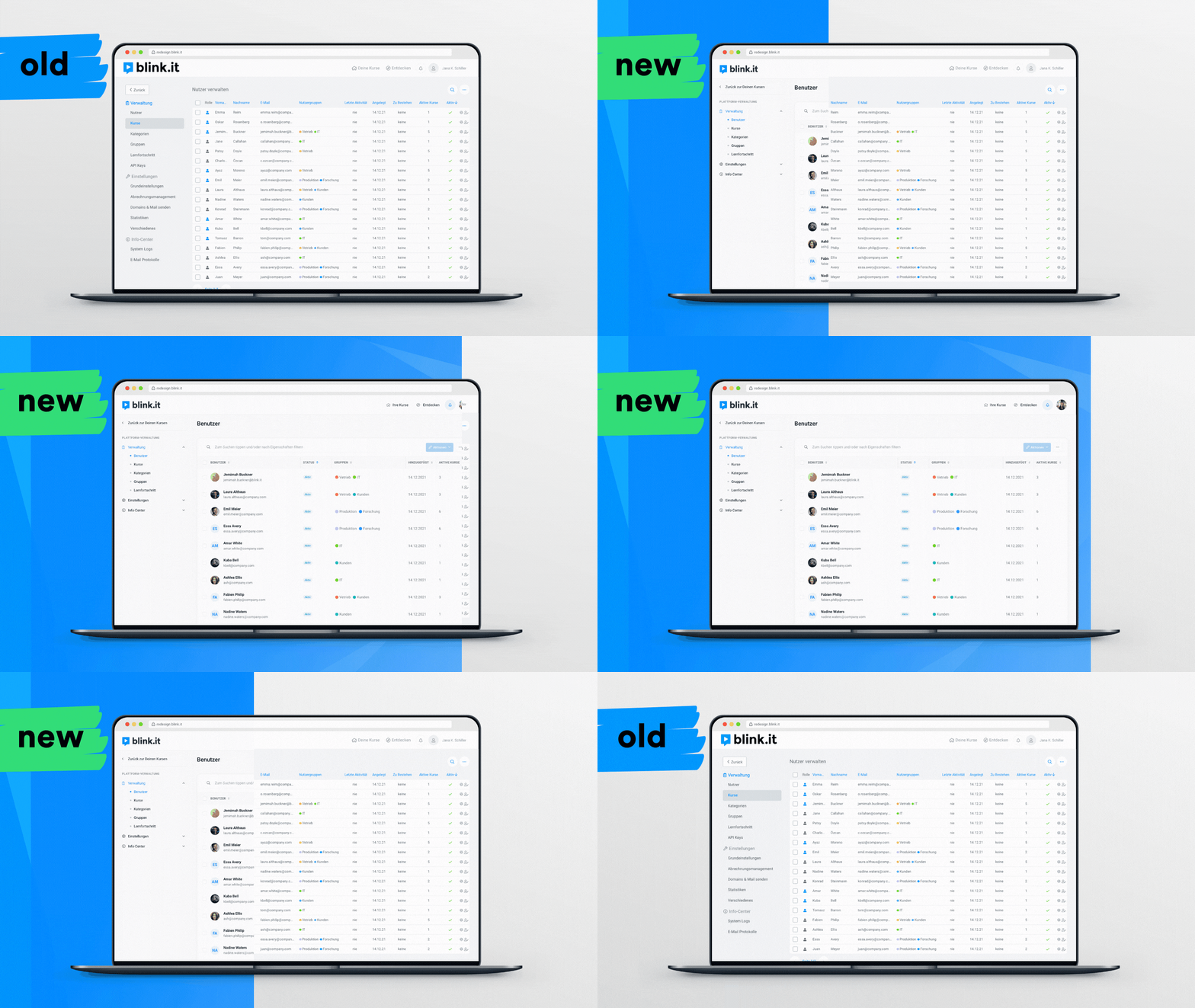
- The sidebar has been cleaned up and folders have been added.
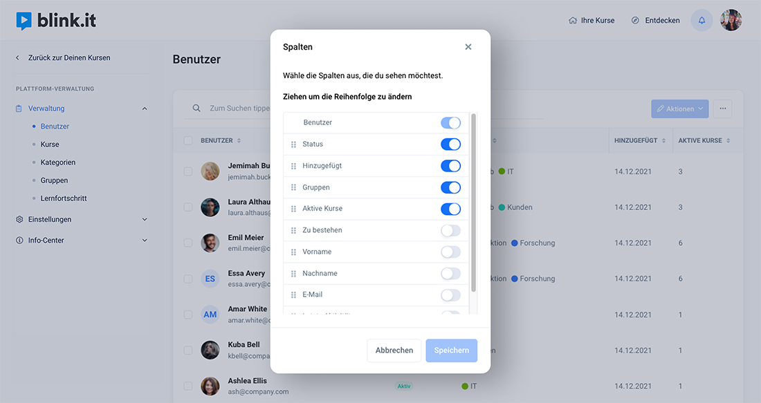
- The tables (not only here, but everywhere on the platform) are clearer and customizable in content and column width:
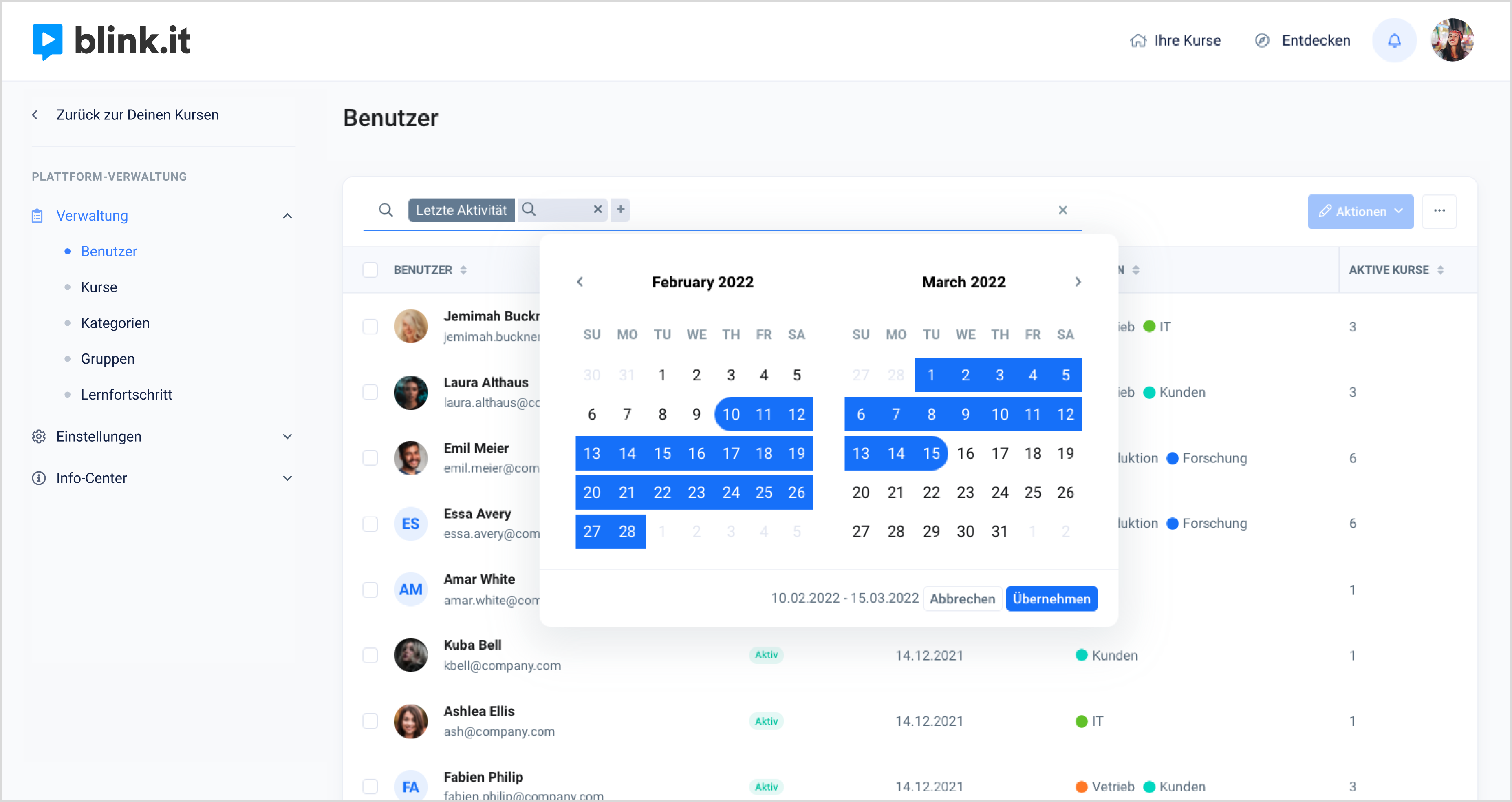
- The search and filter function has been fundamentally reworked and now offers more quick options for finding what you're looking for. For example, the new calendar view for date searches:
Insight into quality-of-life improvements
All packages now include a host of new features that make everyday work easier and faster! Here's a sampling of the highlights:
- Access to user management and new tables (see above)
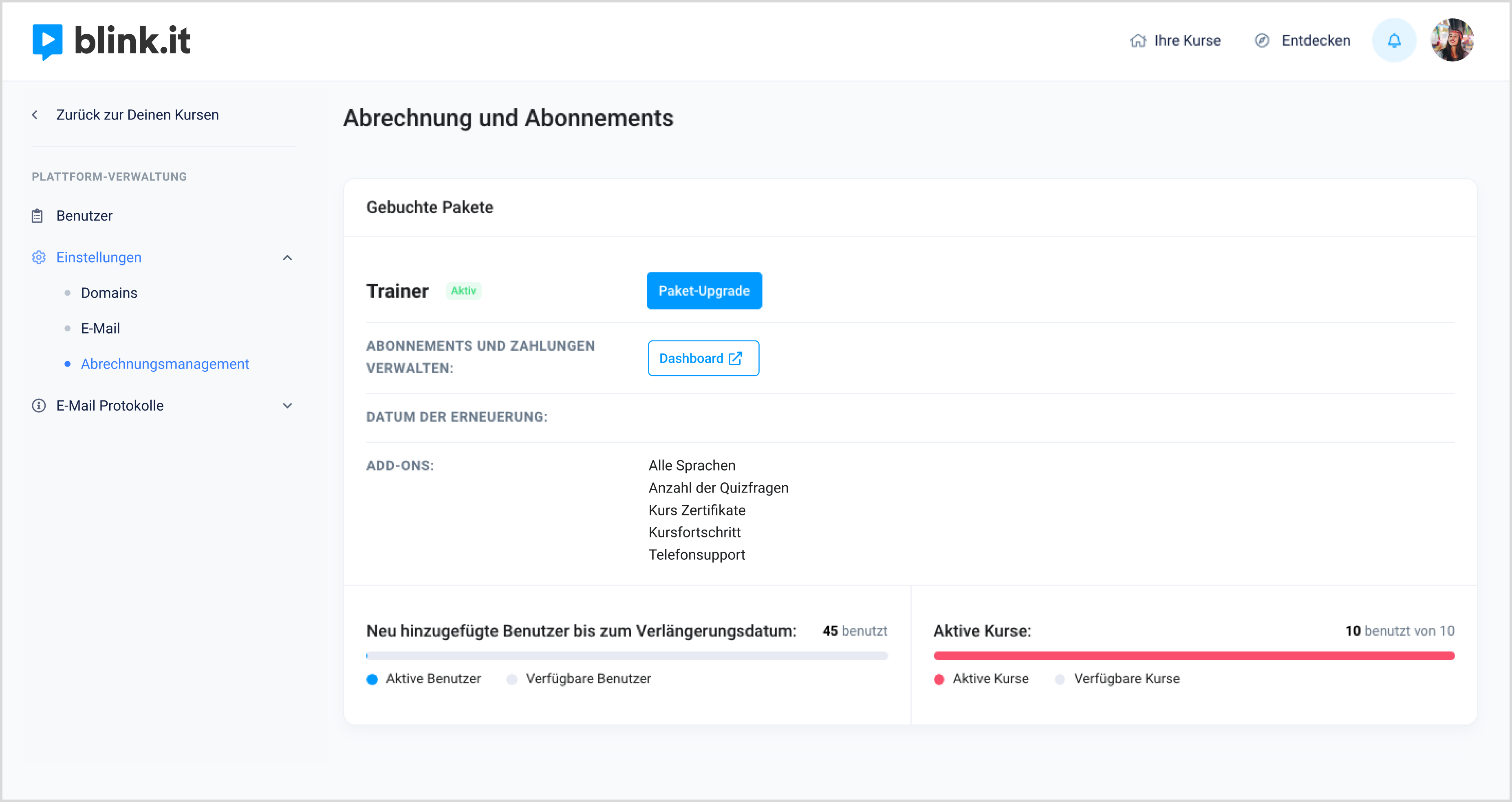
- Billing management: full overview of packages and limits for users and courses.
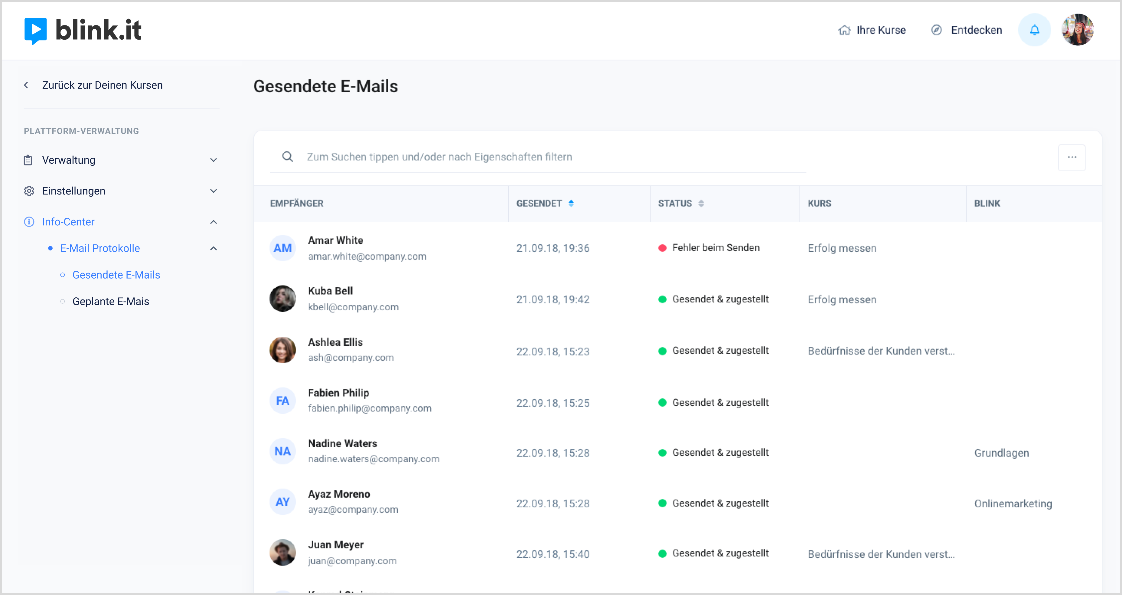
- Email logs: At any time at a glance, see which emails have been sent to users.
All of these features are included in the fresh new design, of course!
How do you like the new design and the new package features? Feel free to give us feedback! Remember: All feedback is valuable in developing the best possible blink.it of the future!


